I realized that I did not elaborate on my previous post on the types of charts very clearly.
There are four main types of charts technical traders deploy in their technical analysis. They are the Line, Bar, Candlestick and the Point and Figure charts. Depending on the skill levels, many traders have different views of which is the best. I shall attempt to input my own thoughts on the plus and minus points in each type of chart.
Line Charts
The line chart is the most basic form amongst the four because it represents only the closing prices over a set period of time. Over a time frame, each closing point is connected by a line.
Plus point: It gives an instant over view of closing prices as the closing price is often considered to be the most important data in technical analysis. Always remember: The big boys always close the market. It could give us a good indication of how a particular stock will move the next trading day.
Minus point: Line charts do not provide visual information of the trading range for the individual points such as the high, low and opening prices.

Bar Charts
Bar charts are the mainstay amongst investors and traditional traders. They’re sometimes called OHLC (open-high-low-close) charts.
The chart is made up of a series of vertical lines that represent each data point. This vertical line represents the high and low for the trading period, along with the closing price. The close and open are represented on the vertical line by a horizontal dash. The opening price on a bar chart is illustrated by the dash that is located on the left side of the vertical bar. Conversely, the close is represented by the dash on the right.
Below is an example of a bar chart:
Plus point: This particular type of chart gives a clearer understanding of the range of prices a stock has been moving during the trade time frame.
Minus point: It can sometimes be hard to interpret information at a glance. The relationships between the open and close, in particular, can become lost in the mix

Candlestick Charts
By far my personal favourite type of chart!
The chart is similar to a bar chart, but it differs in the way that it is visually constructed. Similar to the bar chart, the candlestick also has a thin vertical line showing the period's trading range. The difference comes in the formation of a wide bar on the vertical line, which illustrates the difference between the open and close. And, like bar charts, candlesticks also rely heavily on the use of colors to explain what has happened during the trading period.
Plus point: Candlestick charts provide an enormous amount of data within a relatively small bit of space.
Minus point: A major problem with the candlestick color configuration, however, is that different sites use different standards; therefore, it is important to understand the candlestick configuration used at the chart site you are working with.

Point and Figure Charts
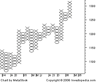
The type of chart is not well known or used by the average investor but it has had a long history of use dating back to the first technical traders. This type of chart reflects price movements and is not as concerned about time and volume in the formulation of the points. When first looking at a point and figure chart, you will notice a series of Xs and Os. The Xs represent upward price trends and the Os represent downward price trends. There are also numbers and letters in the chart; these represent months, and give investors an idea of the date. Each box on the chart represents the price scale, which adjusts depending on the price of the stock: the higher the stock's price the more each box represents.
Positive point: The point and figure chart removes noise or insignificant price movements, in the stock, which can distort traders' views of the price trends.
Minus point: It is just not popular amongst traders. Don't ask me why, I personally cannot really be bothered to use it and neither is my software supporting this kind of charts in the first place.
Types of Charts II
Tuesday, September 28, 2010
Kick start your first foray
Friday, September 3, 2010
I have never been a fundamental trader and never will. As I have mentioned before how a stock moves is very much due to the interest generated during a particular period. Henceforth, I personally feel that some form technical analysis have to be employed.
The first learning curve for all of us is How should we start? I have tried reading books like "Introduction to Technical Analysis" by Martin Pring (Amazing that I can still remember his name since I read it eons ago). However, nothing beats trying it out on your own by monitoring the markets.
For starters, I would definitely suggest a free end of day charting software like Chart Nexus. It is a free software platform that allows feed downloads from almost all markets. Don't expect live quotes from such freewares though. =P
18 Dec SGX Mainboard
Friday, December 18, 2009
Paper traded NOL @ $1.54
Action: HOLD
NOL opened at $1.52 at the market start. It wasn't poised till it went past the $1.54 level (Resistance for the last few days in a row). Chart of NOL before 18 Dec. I believe the next psychological barrier will be at $1.60.


Dow 16th Dec 2009
Thursday, December 17, 2009
Dow has yet again hit the strong resistance level (mentioned in prev entry) and headed downwards for 2 consecutive days.
Signs of increasing interest in selling. I wouldn't be surprise if it continues to be red on the 17th Dec.

Dow Jones as at 3rd Dec
Friday, December 4, 2009

Dow Jones Industrial closed -86.53 (-0.83%) with a volume higher (almost twice) than the day before. It has tested the 10500 range 3 days in a row before heading down on those days. Am anticipating a drop tonight with all the technical indicators turning downwards.
Types of Charts
Sunday, November 29, 2009

Candlestick chart - Similar to OHLC, but open and close are filled. Often Black or Red candles represent a close lower than the open. While White, Green or Blue candles represent a close higher than the open.

Line chart - Connects each closing interval together on a line.

Personally, I prefer using the Candlestick chart as it gives an overall preview very clearly. Future charts shown here will mostly be candlestick charts.
Technical Analysis Explained
Thursday, November 26, 2009
Hi everyone,
Welcome to my blog on my views of the world markets. I started this with the intention of keeping up with the current market trends around the world and giving my take on them.
I started off as a fundamental trader and now I do mainly technical trading.
Why technical trading you may ask?
Lets just start with understanding what technical trading/analysis actually stands for.

What Does Technical Analysis Mean?
A method of evaluating securities by analyzing statistics generated by market activity, such as past prices and volume. Technical analysts do not attempt to measure a security's intrinsic value, but instead use charts and other tools to identify patterns that can suggest future activity.
Technical analysts believe that the historical performance of stocks and markets are indications of future performance.
E.g. At an apparel shop, a fundamental analyst would go around trying out clothes before deciding whether to buy a particular design. By contrast, a technical analyst would observe the types/designs of clothes most people purchase and measure the popularity of each before making a purchase. Disregarding the intrinsic value of the products, the technical analyst's decision would be based on the patterns.
Likewise in trading, a stock only moves in price when there is interests generated in it. Even the strongest company would require continual interest for its price to head up.
See? Technical trading is very much on human psychology and the current buying trends.
I'll attempt to explain further in future posts.
For one sure thing, CHARTS DON'T LIE.